I got this question a few years ago from someone who was designing their own website.They had read in a forum somewhere that it’s bad practice to use a pre-made template. The contention was that if you didn’t design a site from a blank slate, you’re doomed to look like everyone else out there.
That’s a bunch of malarkey.
The reason that some smart developers created templates was to make it easier for the non-coding person to get started building a website. It’s sort of like saying that using a hammer to pound nails into aboard is cheating, whereas using the palm of your hand is more…natural. I mean, ouch—and cosmically stupid.
I think the concern over this question is that everyone wants their website to look different from all the others out there. You want to stand out.That’s smart. But there are reasons that you might want your website to copy the basic layout of other websites, or even color schemes.
I know what this is!
People are used to the way most websites work. There’s typically a navigation menu at the top, maybe a big hero image under that, and then content. A sidebar probably contains information that you don’t need right away. A footer holds extraneous info like social media links, privacy policy link, and maybe a duplicate nav menu.
If you turn all that stuff on its head, your visitors might get confused. There’s a reason they build most cars with the driver in the front. You just know how it works. Same with websites. A template will help you nail the basics.
This feels familiar
Even if you’re unique in your area of interest, you will probably want your website to reflect at least some design elements of similar websites. A real estate website will probably want to center the visitors’ attention on the latest listings. You’ll likely want to display your team, a few recently sold homes, and maybe some testimonials. Again, you can use a template to get the basics down, then tweak it to match your branding.
You want to leverage what feels familiar so you have more room to make it your own.
The color of money
I talked about color in a previous post, but it’s worth repeating.Colors put out signals. Whether we like it or not, we’re conditioned to react to certain colors in a prescribed way. Dark blue usually means trust. Light blue can imbue a sense of serenity. Red means alert! Earth tones typically denote something, well, earthy. Food.Coffee.
Templates can be the perfect way to use pleasantly combined colors, without having to read twelve books on graphic design.
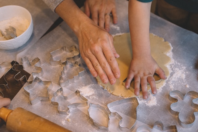
Cookies can be delicious… and nicely shaped!
It’s really okay to use a cookie cutter when you’re shaping cookies, especially if you want them all to look nice together. It’s also fine to use templates in your website and graphic design creations. Learn how to use the tools and make them work for you.
If you’d like to know about some resources I use (yep, I use templates sometimes), comment below and I’ll give you some good links. If you’re an introvert, send me an email.
Leave a Reply